Articles
12 tips to give the illusion of a larger room
Do any of the rooms in your house cause you headaches due to its smallness? Don't panic! There are many ways to create illusions of space without even pulling out the heavy equipment. Here are our best tips!

How to choose THE right paint
Cleverly use paint
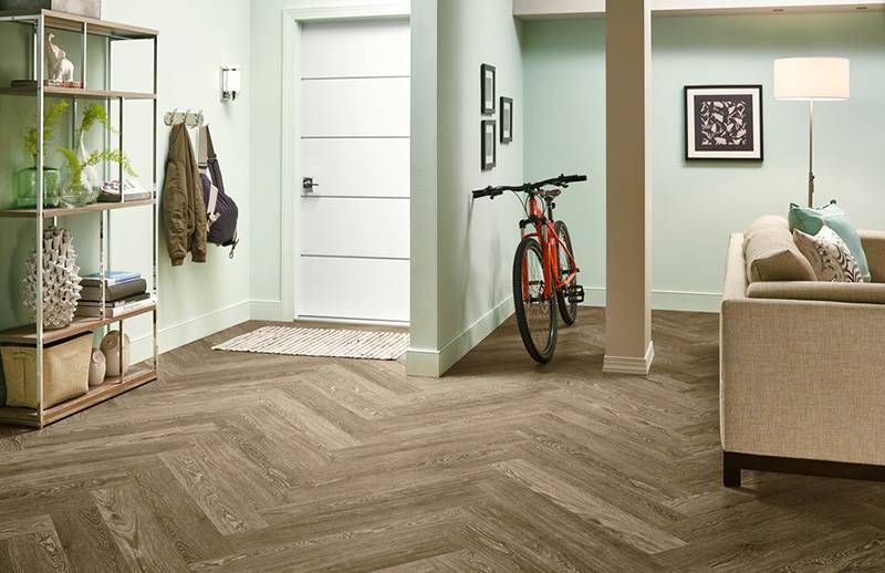
We know that colours have an impact on our mood, but it is not their only "super power". They are also useful to thwart our senses. Dark shades on the walls absorb light and give the impression that they are closer together. The opposite happens with light colours. The best options for maximum expansion are cold and pastels shades.
A ceiling that is forgotten
In the 1990s and 2000s, dark-coloured ceilings were not unusual. This trend of the time was perfect in bulky rooms that lacked warmth, but was a big mistake of style in small spaces. Indeed, we felt suffocated! If you want to paint the ceiling, use subtle, pale tones.
Windows dressing choice
Make the most of window treatments
Curtains and blinds should not be chosen without consideration, especially when intended for a limited space. Fabrics should be light and pale. Also, avoid velvets and warm, dark colours. When it comes to blinds, prefer shades that blend with the decor, such as whites. For example, a black blind fixed to a cream wall will accentuate the effect of smallness.
Sheers: an obvious choice
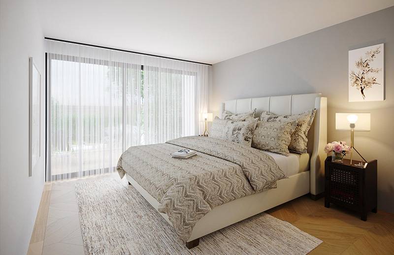
Switching from curtains and blinds to white sheers is also a wise choice. The latter scatter light, which visually enlarges the room. It is suggested to place them from the ceiling to the floor and a few centimetres wider than the frame. Moreover, small rooms are ideal for having a wall that is completely covered with sheers (the one with the window).

The bightness of a room
Let the light in
The sunnier and brighter a room is, the larger it looks. Opening the curtains is not enough to bring in the light. You can multiply the light sources to create visual textures. Built-in, table or wall lamps and candles are to prioritize. However, it should be noted that a freestanding luminaire gives the impression that the ceiling is overwhelming. To avoid!
Bringing shine
Adding lacquered furniture and accessories to your settings is a great idea. Mirrors are also popular because they reflect light. It is best to place them on the wall opposite the window. But if they reflect something visually cumbersome - for example, a well-filled library - it is better to remove them.
How to avoid clutter in a room
Sliding doors, please!
When there is not enough space, everything seems to be in our way! An open door takes up space: if you can, change the main door, the wardrobe door and the furniture door for a sliding option.
A spacious and uncluttered space
Visual load has a strong impact on a room: the larger the furniture, the more items exposed and the more objects on the floor. It will appear smaller. It is therefore necessary to clear up, or at least hide as many items as possible in storage spaces. Also, there must be traffic areas: you should not have to turn to move around, for example to reach the closet
Long live the low-lying furniture!
To give the impression that the walls are higher, they must be unobstructed. For example, hanging several frames, placing a bookcase or installing a vertical cabinet is a mistake. Short-legged furniture, made lengthwise, will be more harmonious. Also, furniture that does not have legs will make the room heavier: choose furniture that has space underneath or can hang on the wall.
Translucency, an ally!
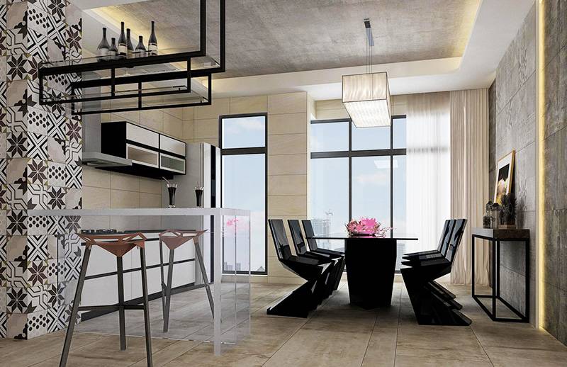
In a small room, it is better to choose a single large piece of furniture rather than several small ones. Also, see-through objects can be good allies: for example, table chairs in a small kitchen or a glass coffee table.

The mixtures of textures and patterns
Floor covering: what to avoid
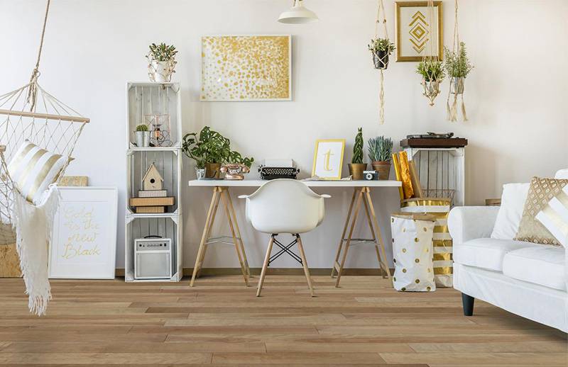
What should be put on the floor to lighten the look? If you choose tiling, avoid oversized or undersized tiles: go with the right balance. Light colours should be prioritized for ceramic tiles or wooden floors. Also, many textures - for example, wood grain - can make them visually cumbersome. A glossy finish is an enlarging finish. As for carpets, their enveloping composition unfortunately gives the illusion of a confined space.
Creating horizontal lines
You probably already know that wearing a horizontally lined clothing will make you look wider than you really are. This optical illusion is the same in decoration! Draw horizontal stripes alternating light matt and glossy paint. This will give a subtle... but effective result! The trick of horizontal lines can also be done with furniture that, when placed at the same height, will create a visual sequence.

Do you have any questions that have not been answered in this article? Feel free to visit a Deco Surfaces store to chat with our professionals. Their creativity and resourcefulness will surprise you!

